5 principles of articulation!
As a brand consultant, it is not only important to have and analyze information, but also articulate it in the most impactful way possible. This is because my line of work is very subjective. So unless my presentation has the right flow and design, it stands the risk of being misinterpreted. Especially, if I have to mail one across to the client (something any consultant should avoid). Over the years, I have worked hard to teach this to my team and perhaps it is time to pass it on to you guys too. I will try to explain with examples so that you can appreciate the detailing.
There are 5 basic principles that one needs to keep in mind for a PPT that has a WOW reaction. And mind you, all are inter-dependent:
- The Objective
- The Structure
- The Ease
- The Cues
- The Extra Mile
I shall explain each of them in detail. However, because we deal with a lot of information as consultants, we often fall into a trap of sharing all of that with clients in our PPTs. That to my mind is the first mistake we make. We do this mostly to:
- Prove how much credible info we have dealt with
- Represent the amount of work and analysis done
- Show how much time we have spent on the PPT
- To justify our recommendations and cost
But in doing this, we lose IMPACT! Why is that? Shouldn’t our clients be happy to see more and more info in our PPTs? They paid for it after all. The simple answer lies in the definition of IMPACT- it is to have a profound effect in as little time as possible.
Depth in any PPT comes from our effort to minimize the time spent by the client and maximizing the takeaways. They should be able to trust us with the information we use to arrive at the recommendations. Even if it is just a 5 slide PPT.
Keeping the above in mind, here is what I mean by the 5 principles:
THE OBJECTIVE
This is really at the heart of all presentations. As consultants, we need to make this the start point. Never lose sight of it. What is the main objective of this PPT? What is the client looking to get out of it? Have we answered their questions? Have we given clarity on the subject that was vague? For me this should start every PPT. Remind everyone why you did this exercise. And list the questions that you are answering today.
Under the objective, it is also the target audience that plays a huge role in deciding the impact of your PPT. We often assume that all who listen to us are also consultants. No, they are not! Therefore, to understand and respect your audience is a key factor here. In fact there are times when you might have to make a presentation for the marketing head of a brand, who has to in turn present it to the CFO may be? In that case the objective might change for the right impact. This is not to say that the essence of the PPT will change. But the audience decides the structure one should adopt and the cues one should use to send the message in the right manner. Something like COLDPLAY choosing the right flow of songs for a concert in India versus USA.
But please remember, no matter what the objective, do not have too many takeaways in your PPT. Pick the key ones and focus on those to be absorbed and approved. The rest will be discussed eventually when the execution begins!
The Structure
Once we know the objective and the target audience, the next main principle is the structure of the PPT. I find that we do not spend as much time on this and hence tend to go all over the place. Structuring a presentation requires clarity, intelligence and creativity on the part of the consultant. The best PPTs are those which are like an intellectual journey. Orchestrated to have the maximum impact like a crescendo. It is exactly like the job of a conductor.
The best way to structure information is to look at the objectives and put them into various buckets.
Eg: Objective is to understand the potential for growth of the industry. And also the potential of growth for the brand in order to get funding.
These can be clubbed under:
- Industry potential- Why this business?
- Brand potential- Why us?
Now look at the info you have to address these objectives and structure them accordingly. Say you have:
- A report taking about the various brands that did brand building before and IPO and were successful.
- A report that tracks the trends in the industry- organized and unorganized.
- A report on the top tips for an raising funds and what investors look for.
- Challenges facing the industry today- qualitative account.
- An internal company report that shows that customers are looking for branded services.
- A mapping of competition and their positioning strategy.
- Business growth details with analytics and also brand loyalty programme analysis.
- A document on the brand vision and mission and future plans.
This list can go on and on… and be quite overwhelming. But if you compartmentalize them into the 2 objectives, suddenly you see some structure and a flow.
The other thing one should do is build the case by funneling. First start with the macro data. Then look at the industry based data. And then the company specific info. This again takes the client through the analytical journey that is much easier to grasp and retain. Jumping from one topic to another without prioritizing and funneling can lead to noise and chaos. It will eventually lose impact and you will feel all your work was in vain. The client should be told the flow and what to expect.
THE EASE
By ease, I do not mean EASY. I mean user friendly.
This is the most important part of the article because it is driven by many things and is the hardest to achieve. Under the principle of ease comes the design of the PPT, the fonts, the graphics, the colours and of course the amount of content.
The ease of a PPT is also driven by its audience. If you are presenting to kids, the approach will be different than presenting to a parent. We have to keep their fears, challenges and their motivations in mind. We also have to ensure they do not feel overwhelmed or consumed by us. Nor should it be underwhelming and below expectations. It has to strike the right balance!
Infographics is a great way to achieve ease for complex data. Also, using charts, graphs instead of paras. We rarely copy paste tables and graphs that we get from reports. They are all recreated for maximum impact. Animation is another tool to enhance the ease of any PPT. Showing data one by one can have the right build up to the conclusions and recommendations. I often come across slides full of graphs shown to me all at once. If that is animated it changes the whole experience.
Also, highlighting the numbers you want them to focus on will again add to the impact and takeaways. The intention is to not waste time searching for the data that is important. It distracts the client and can also feel like a waste of their time. So make the extra effort and circle the important bits.
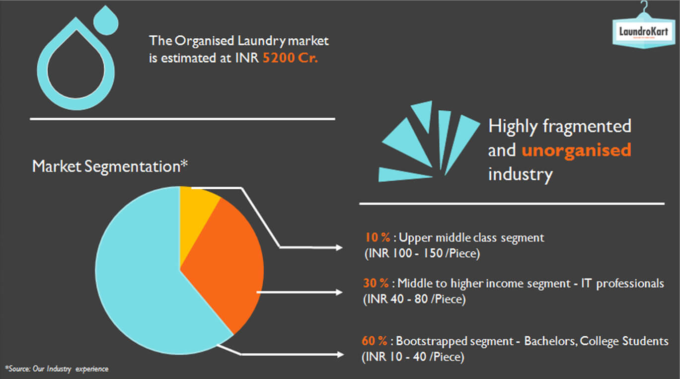
The below example shows how much effort we put into the ease of a PPT. This data was available to us in pages and pages (all text) or tables/exhibits. We made it into a graphical map that highlights the key numbers in the most user friendly manner. Idea was to highlight the states with the highest number of cold storage units, so that the client could prioritize those for its business development.
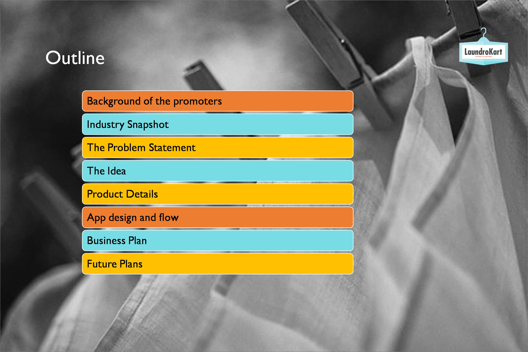
Another thing under “Ease” is to try and kill monotony through clever ways. PPT templates are great, but you should try to shake things up every few slides to avoid a blind spot developing. This can be done by just simple things like moving the picture from the left to the right in every alternate slide. Or by giving breakers before you jump into a new topic. Below is a breaker:
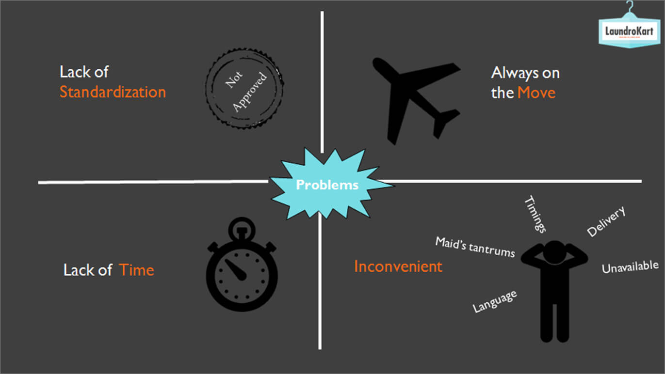
Use of icons are another way to make your PPT user friendly. Nobody has the time to read. The easier we make it for them to understand what we are saying, the better. So visuals matter! The slide below could have been made with just text and bullet points. But instead it was animated, and had interesting icons to describe the problems.
The Cues
We consultants must always try to guide the client in the direction we think is the right one, based on all the info and analysis. However, the victory lies in making the client believe that they got their on their own. I measure the success of my presentations based on whether my clients start completing my sentences for me by the time I get to the recommendations or not. That is a clear sign of impact. Because they are telling you the logic of your recommendations based on all the cues you’ve given them.
That brings me to the 4th principle of CUES. Something that the Media uses a lot of these days. And they underestimate its influence on young minds. Cues in a PPT are in the form of words, visuals, priorities and of course examples.
- If I wish to show something alarming, I will probably use RED. Otherwise no red at all in my PPT. Choose the font also very carefully. It is a big tool for cues.
- And if I want the client to spend some time brooding on a takeaway, I will make it a clutter free slide and just focus on that 1 thing.
- Showing a tick and a cross are not the same cues. If I try to tell the client what they have done well, I may use a tick. But the areas of improvement need not have a cross next to them because that might send out negative cues. Instead I will just state them as areas of improvement.
- Examples and more examples! If I want the brand to behave like a certain personality, I would just show examples relevant brand but also of what not to do. These work as blinkers for the brand to stay on track.
- It is the cues that also help in connecting the dots along the way. And help paint the overall picture of the recommendations.
- Asking questions. And then steering them into the answer. Encouraging a debate and then moderating to a conclusion.
The Extra Mile
This is the principle that separates good consultants from the great ones. When you go the extra mile for insights, examples and information. This is where you exceed expectations and go beyond the brief given. It is the key ingredients to make a lasting impact on clients and to win their long term trust and loyalty.
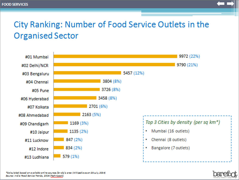
Here is an example of this in on of our assignments. We had the information on the cities with the largest number of food service outlets. However this was done for a start up QSR company and the data was suggesting we focus on Mumbai and Delhi. So we went the extra mile and looked at the density of these outlets as per the city’s size. That threw up Chennai and Bangalore in the TOP 3 which was a much better bet for the brand to start its operations with.
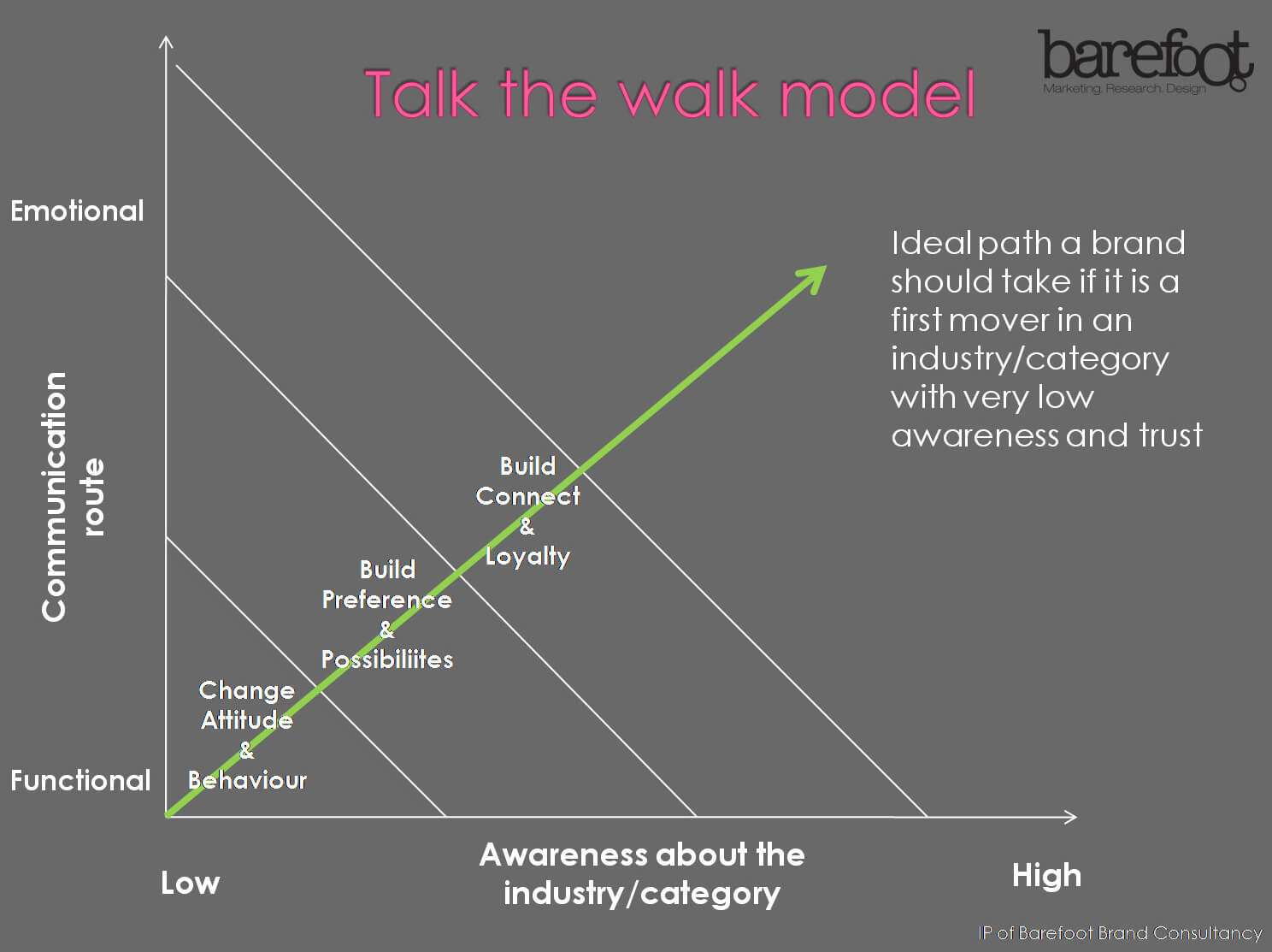
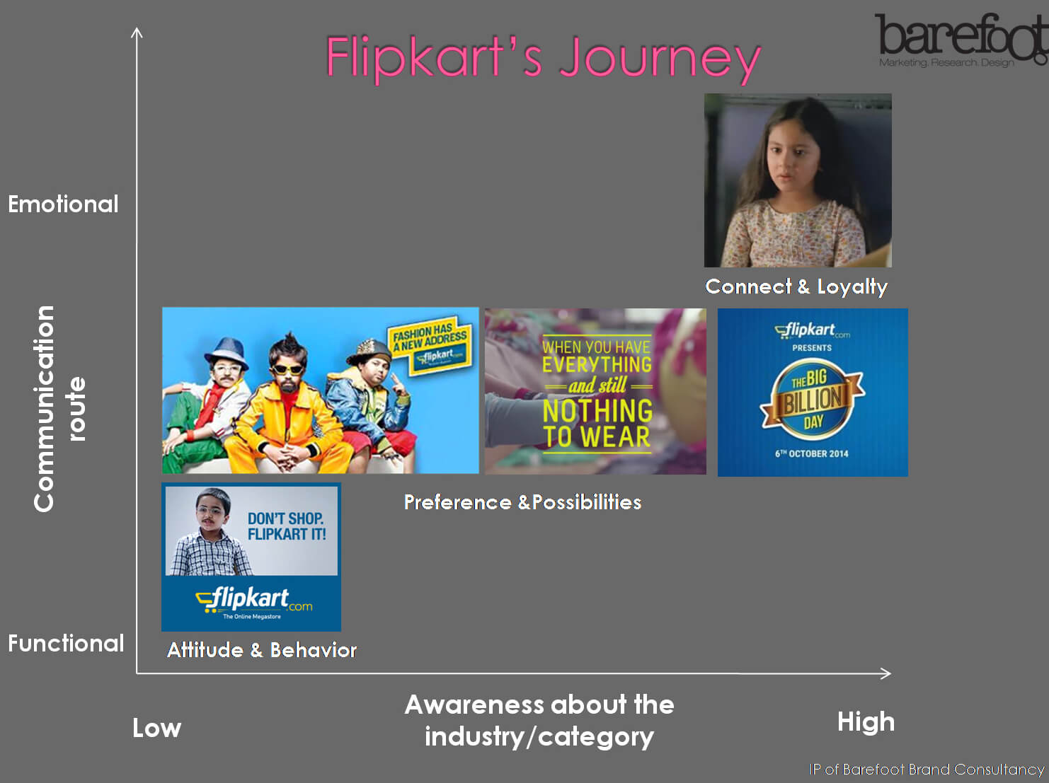
Another thing one can do is add meaningful quotes by people or marketing models to the PPT in order to explain the context better. Recently we added this model for a client that needed to convince its board about making the communication more emotional. This marketing model is created by us and is our IP. It really became the focal point of the entire discussion. We supplemented it with examples of brands that have done this successfully.
I hope this article was helpful. Please do share your feedback and comments. The attempt is to keep improving and sharing our day to day experiences with you all.
(All the data shared does not violate any NDAs that we sign with clients.)
Written by


